Ode to Beauty
Helping Ode to Beauty increase conversions and reduce bounce with a visual-first redesign.
- Duration
- 6 weeks
- Role
- Lead Designer
- Team
- 3 designers, 1 PM
- Industry
- E-commerce, Beauty
Impact
Project Impact
100%
Task completion rate (from 27%)
~2 min
Average task time (from 4.2 min)
80s
SUS score
Key Achievement
From generic marketplace to a real brand
Transformed the site from a generic marketplace to a real brand that builds trust with social visitors and converts marketing spend into sustainable revenue.
My Role
End-to-end design ownership from research through concept, UI design, and testing.
- Analytics & heatmap analysis
- User testing and research
- UI design and prototyping
- Design system creation
Team
- DL
Design Lead, Me
Requirements & business alignment
- D1
Designer #1
Campaign strategy & testing
- D2
Designer #2
Visual design & component creation
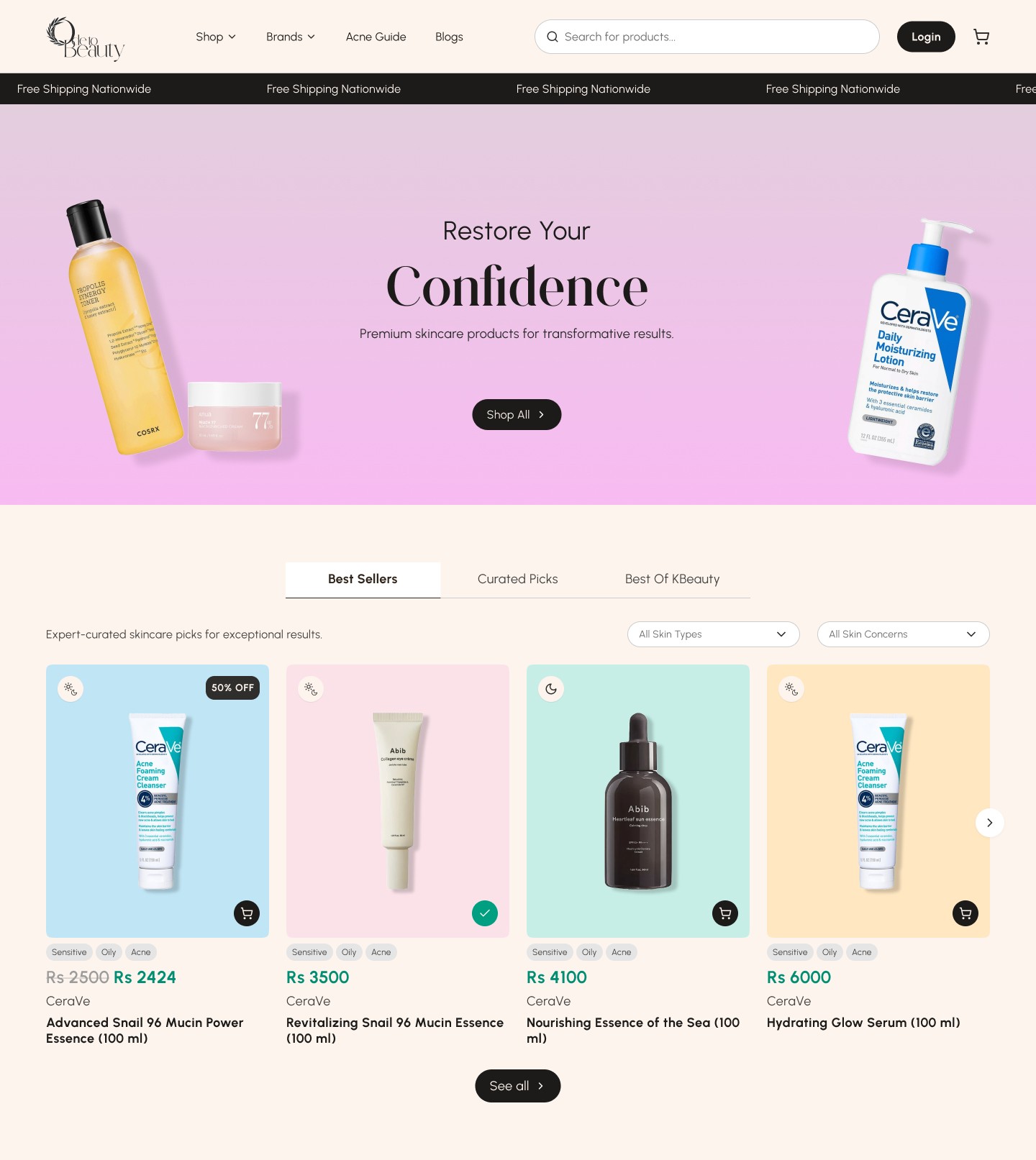
Problem Framing
A generic marketplace, not a curated beauty brand
The Problem
The existing site felt like a generic marketplace rather than a curated beauty brand. A product experience that didn't convert social visitors.
- Unclear navigation and weak hierarchy
- Generic marketplace feel vs curated brand
- Poor conversion of social traffic
Why It Matters
With these issues, the brand risked continued poor performance from paid campaigns.
- High bounce rates from social traffic
- Poor marketing ROI due to low conversion
- Lack of brand differentiation in the marketplace
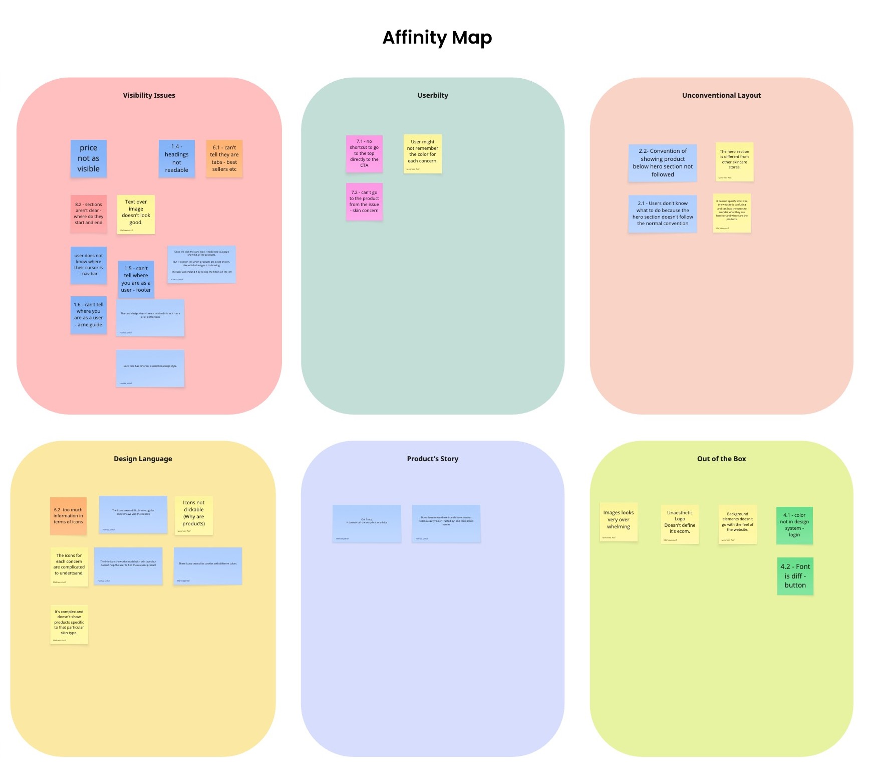
Key Research Insights
User Clicks
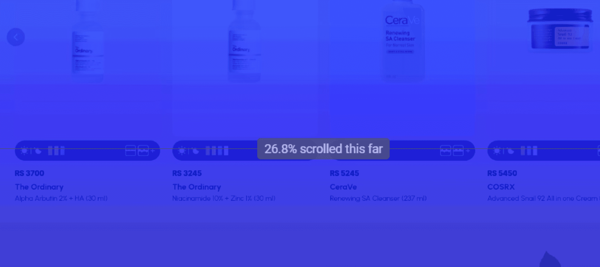
Content Discoverability
Time Duration
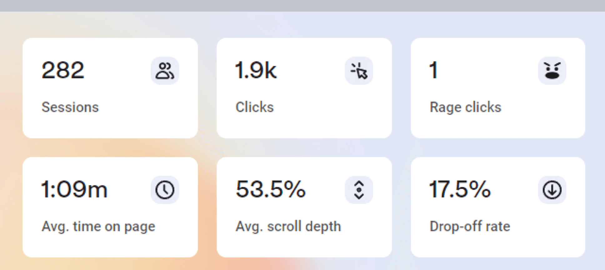
Overall Benchmark
Supporting Data
High
bounce rates from social
Low
conversion rates
Poor
product discovery
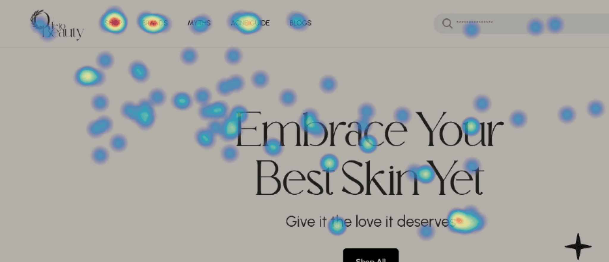
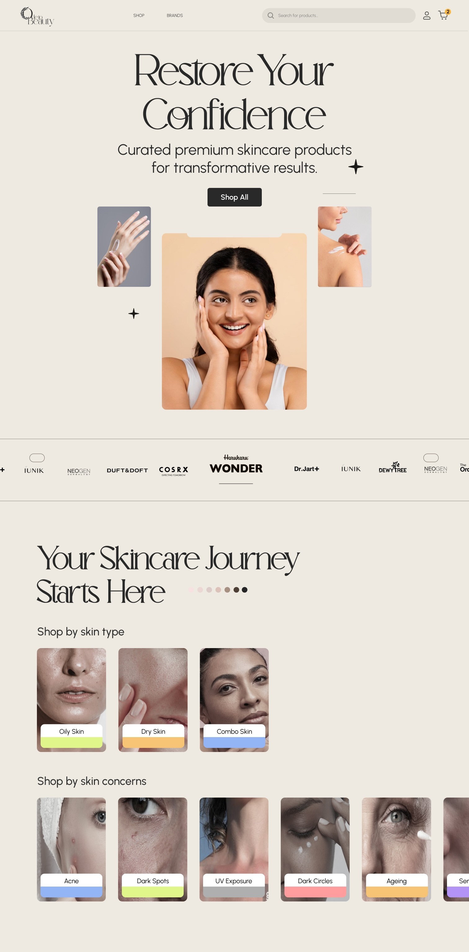
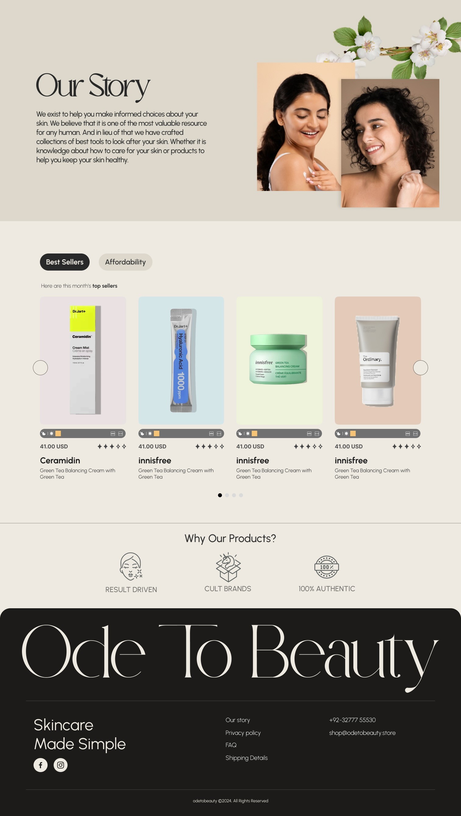
Old Design
Approach
How I worked
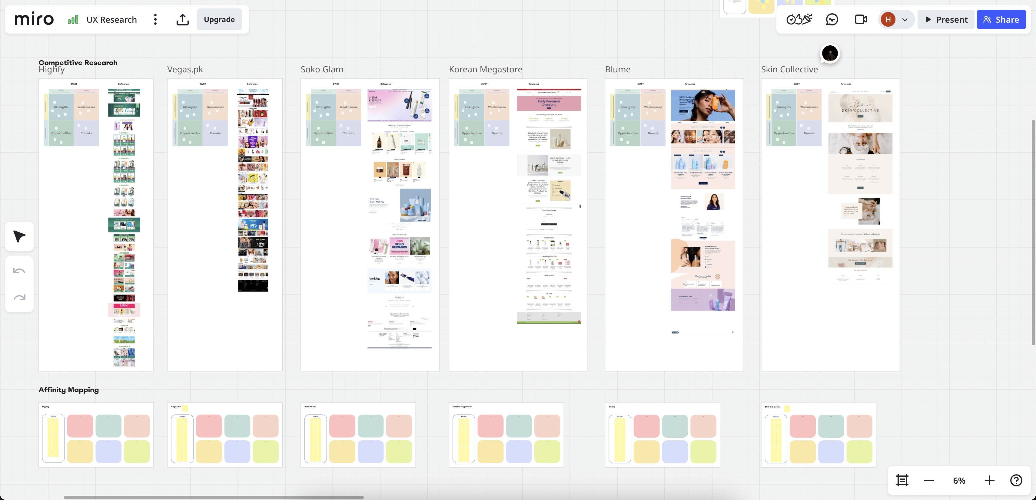
I combined heuristic evaluation with behavioural analytics (Hotjar) and competitive benchmarking against Soko Glam, Highfy, Vegas.pk, and Blume.
Design Strategy
Keep the brand's boldness, but anchor interactions to recognisable e-commerce patterns so users never have to guess where to click.
Phase 1
Analytics & Research
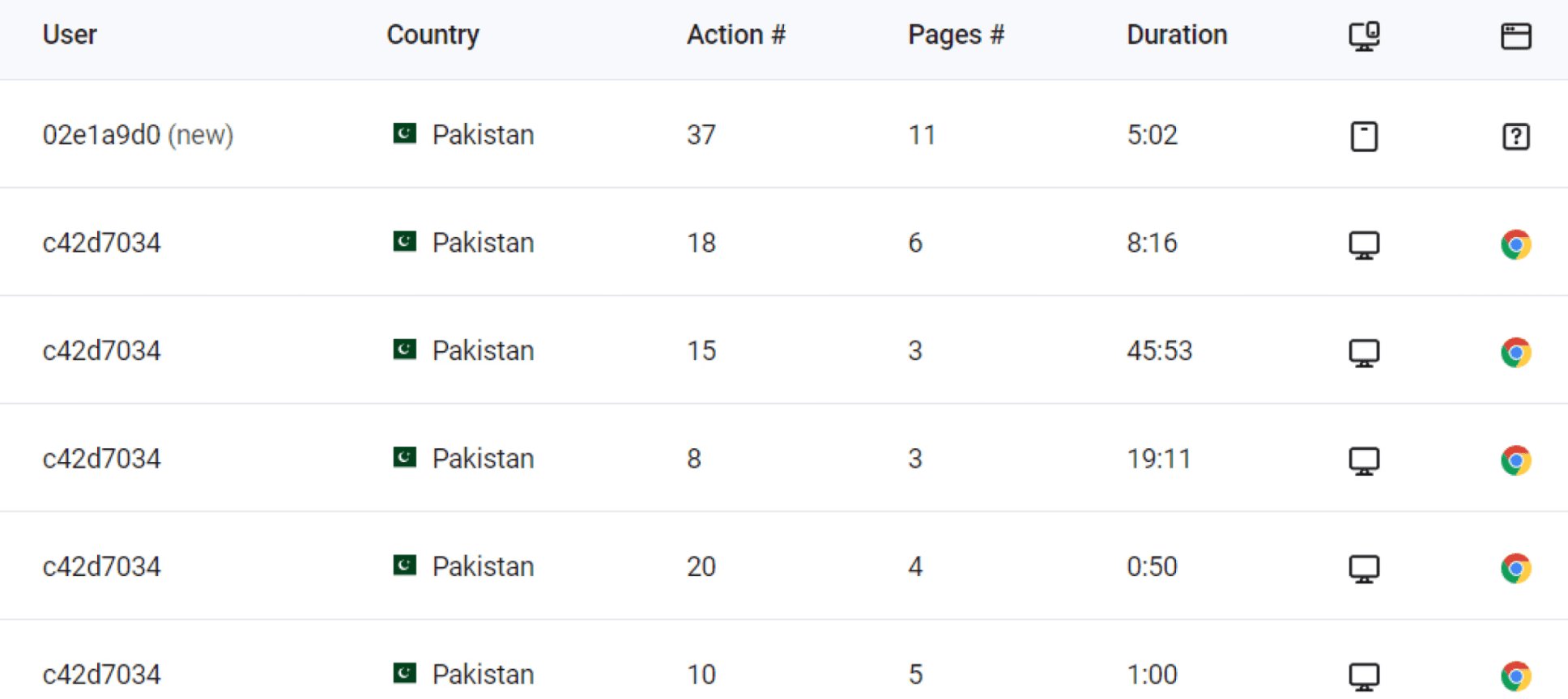
Heatmap review, drop-off analysis, and moderated user sessions.
Phase 2
Ideation & Testing
Trying different approaches and clickable prototypes for validation.
Phase 3
Design System
Typography, colour tokens, and reusable components for consistency.
Research Methods
Combined quantitative analytics with qualitative insights from lightweight user testing to identify pain points and validate design solutions quickly and confidently.
Method
Analytics & Heatmaps
Tools: Google Analytics + Hotjar. Focus: Drop-off points.
Method
Moderated Testing
Sessions: 1:1 + guerrilla. Tasks: find & purchase.
Method
Heuristic Audit
Focus areas: hierarchy & CTAs. Accessibility: basic compliance.
Heuristic Evaluation
Competitive Research

Challenges
Four problems that showed up in testing
Skin-type filters were not discoverable on the homepage.
Solution
Created a Skin Type section where users can find products by their specific concerns.
Out-of-stock items lacked clear labelling. A user didn't know until they clicked Add to Cart.
Solution
Out-of-stock items were placed at the bottom with a clear visual indicator.
Icons were misunderstood (AM/PM mistaken for dark mode).
Solution
Introduced icon and colour labels so users don't have to guess the meaning.
Ingredient details were dense and off-putting for some users.
Solution
Organised the content through clearer visual hierarchy and tags.
Key Learnings
Fast research is enough signal
Fast, focused research plus analytics provides enough signal to make confident design changes without a long discovery phase. A small amount of visual polish can have outsized effects on perceived brand value and trust for social visitors.
Solution
Three principles, one design system
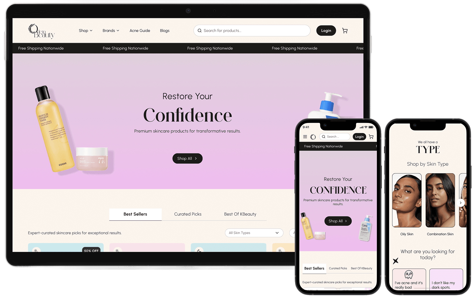
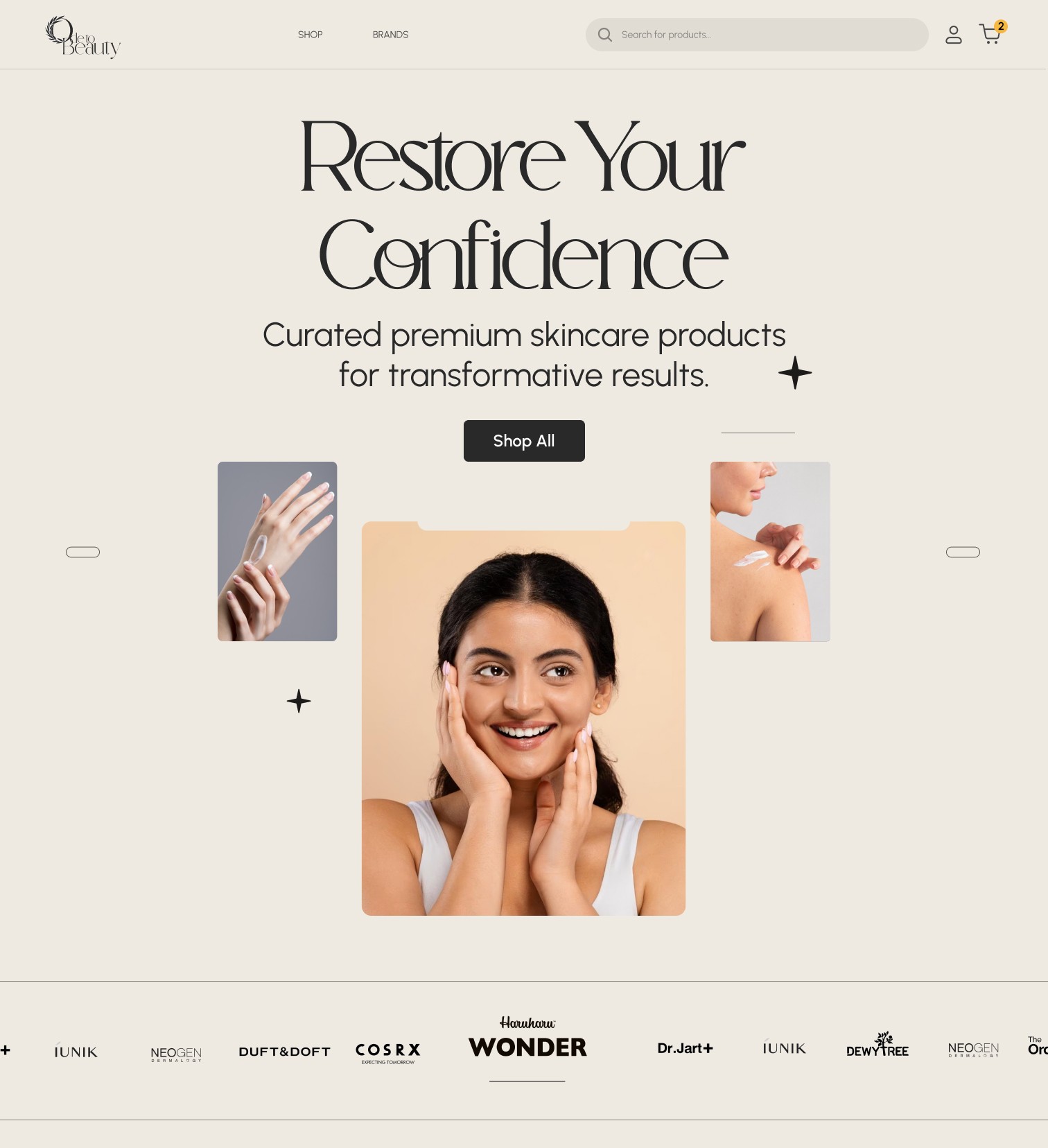
Redesigned the homepage and product flow for clarity. I emphasised discoverability by skin type, relocated and styled CTAs for stronger visibility, simplified ingredient layouts, and introduced consistent typography and colour tokens across the site.
Visual-First
Bold, immediate visual impact for social visitors.
Trust & Social Proof
Clear signals to reassure social traffic.
Simplified Journey
Streamlined path from discovery to purchase.
Design System
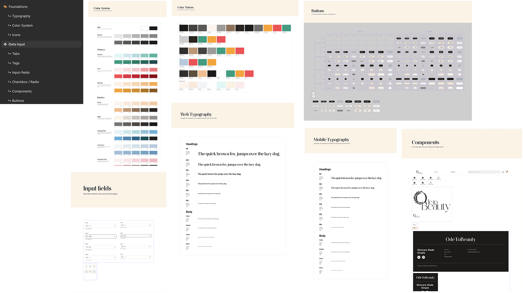
Key Features
- 1
Hero & Landing Pages
Bold, visual-first banner with clear CTA and product spotlight.
- 2
Product Cards
Simplified hierarchy: image, benefit line, price, single CTA.
- 3
Navigation & Categories
Reduced categories with clearer labels and improved linking.
- 4
Trust & Social Proof
Shipping info, best-seller badges, and usage hints.
- 5
Micro-copy & CTAs
"Add to bag" changed to "Add to cart". Added value-added packages like free shipping.
Before & After
Main section
Product card
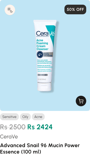
Side-by-side walkthrough
Test
Usability & SUS Snapshot
Moderated remote sessions (Google Meet) with 5 participants using a think-aloud protocol. Three observers captured notes. Tasks and prompts were consistent across sessions. Surveys were collected via Typeform and aggregated in Google Sheets.
100%
Task completion. Prototype testing achieved full completion
~2 min
Average task time. Users complete tasks in under 2 minutes
High 80s
SUS score. Strong perceived usability
User Impact
Prototype Testing Results
- Task Completion27%→100%
- Average Task Time4.2 minutes→~2 minutes
- SUS ScoreLow scores→High 80s
“The site now feels like a real brand,” and participants found product options much faster than before.
Business Impact
Better Landing Pages
Marketing now has improved destinations for social campaigns.
Reduced Friction
Clearer path from social discovery to purchase decision.
Brand Perception
Site now feels like a curated beauty brand, not a generic marketplace.
Next Phase
Live A/B testing planned to measure real-world conversion lift and revenue impact from the new design system.
Next Steps
Planning the next phase to measure live impact and expand the design system.
A/B Testing
Measure real conversion lift and revenue impact.
Component Library
Expand to product detail and checkout flows.
Mobile Optimisation
Continue iterating where social traffic lands.