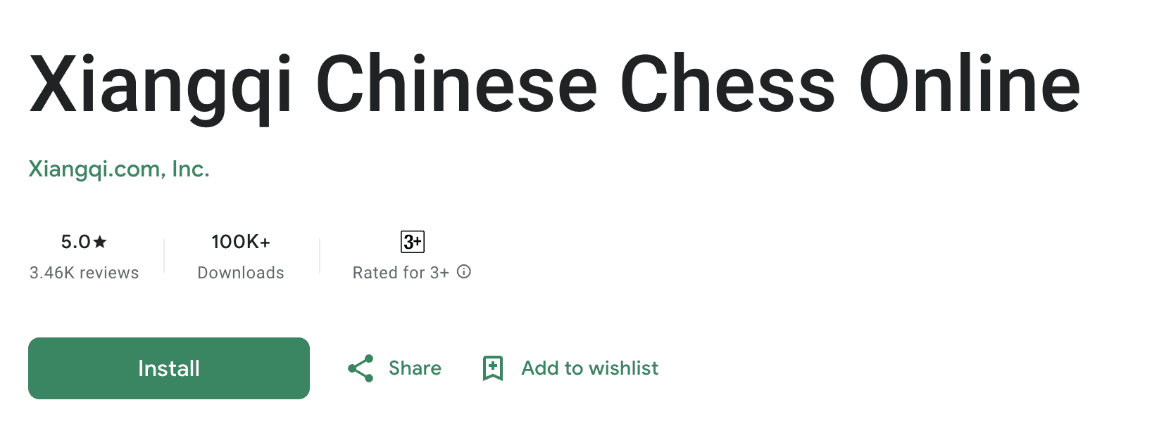
Xiangqi.com Chinese Chess
Xiangqi.com is a product based on the Xiangqi ancient board game similar to Chess. Players can register for free, chat, and play against other players, or with AI-powered bots at various skill levels.
- Role
- Product Design, UX Research
- Duration
- Jan 2021 to Dec 2022
- Industry
- Entertainment, Gaming
- Team
- 8 (PO, Tech Lead, Engineers, QA)

Overview
Role
Product Design, Design Strategy, UX Research, UX Writing, OKR planning
Tools
Figma, Squarespace, Adobe Illustrator, Jira
Duration
Jan 2021 to Dec 2022
Outcome
What changed
1.79% → 11%
User conversion increase
100k+
Downloads on the Play Store
20% → up
Retention rate
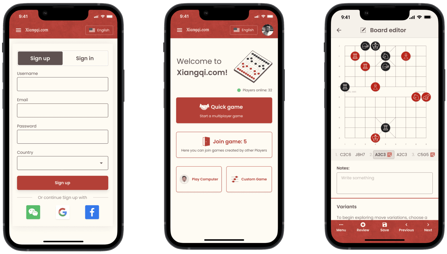
Final Design. Read on to see how I got here.

Context
The Problem
Existing users of Xiangqi.com expressed frustration with the lack of engagement and the complexity of the interface, resulting in a low user retention rate of 20%.
Objective
The business objective was to achieve a 10X growth in user base within one year. To support this goal, the design objective was to increase user engagement and retention by optimising the interface and driving conversions.
My contributions
- Proposed a complete redesign plan for information architecture and platform navigation.
- Identified key areas of improvement by conducting a UX audit and analysing user feedback.
- Introduced cohesive brand guidelines and design systems for web and mobile.
Team
The total team members were 8 including a Product Owner, Tech Lead, Engineers, and QAs.
Research
Understanding existing implementation
When I joined, the product's primary focus was on delivering functionality, so most of the implementation was carried out by engineers. To improve the product, I researched competitors, identified usability issues, and prepared a document to discuss them with a Product manager.
User problems
We embedded a “Rate your experience” popup to collect user feedback. It was shown to the user after completing a game. From that, we prioritised the three most common problems:
Overwhelming interface
Too much information during gameplay made it hard for users to focus on the game.
Game Customization
Users reported they couldn't find games where they could change the timer and play settings.
PVP games
Users were unaware of the most important feature (inviting friends) due to poor navigation.
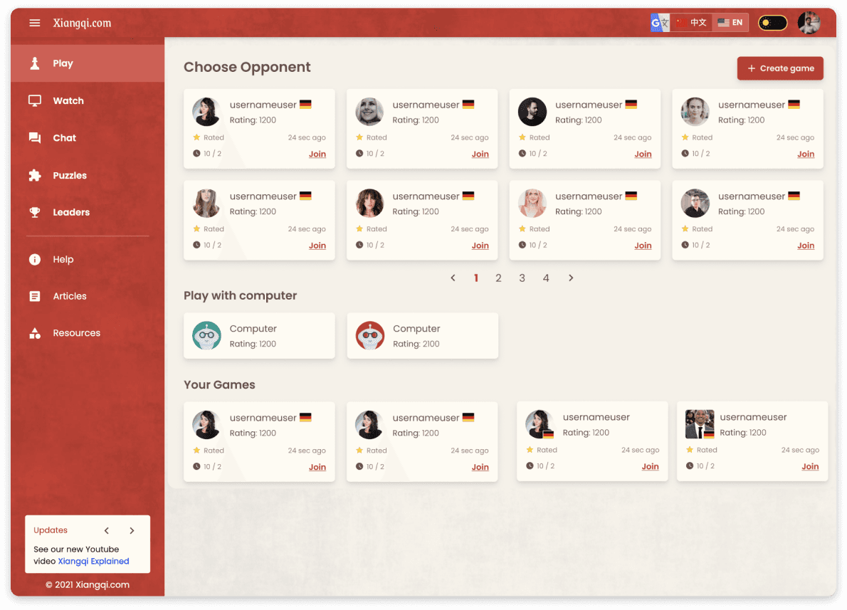
Old Lobby - Version 1
A central hub where players can browse and join games based on their skill level and game-mode preferences.

Phase 01
Competitors Research
I started by exploring the chess-based apps that were most commonly used by people around the world.
Purpose of research. This research study was conducted to collect users' insights on the board games Chess.com and Lichess.org. The insights gathered contributed to shaping the solutions to improve user conversions of Xiangqi.com.
Approach. I divided this study into two main phases: Competitors Research and User Reviews. For the prior, I conducted a detailed analysis of several multiplayer solutions to identify their value proposition, feature set, flows, and common design patterns. For the latter, I wanted to capture more quantitative insights from users, for which I included heatmaps and game reviews.
Value Analysis
Conducted a value analysis to state the strengths, weaknesses, target audience and key differentiators of each competitor.
| Platform | Value | Users | Strengths | Weakness | Launch |
|---|---|---|---|---|---|
| Chess.com | Comprehensive chess platform offering tutorials, puzzles, and tournaments. | Casual players, serious chess enthusiasts, and competitive players. | Extensive feature set including tutorials, puzzles, articles, videos, and live tournaments. Strong community. | Subscription required for full access. Interface can feel cluttered. | 2007 |
| Lichess.org | Free and open-source chess platform with a focus on simplicity, fairness, and accessibility. | Competitive players seeking an ad-free experience. | Completely free, no ads or paywalls. Puzzles, analysis tools, tournaments. | Limited social features compared to Chess.com. Some users prefer a more polished design. | 2010 |
| TianTian | AI-powered chess platform providing personalised training and analysis. | Players looking to improve through AI-driven insights. | Advanced AI offers personalised training tailored to strengths and weaknesses. | Smaller user base than Chess.com and Lichess. Limited community features. | 2021 |
Phase 02
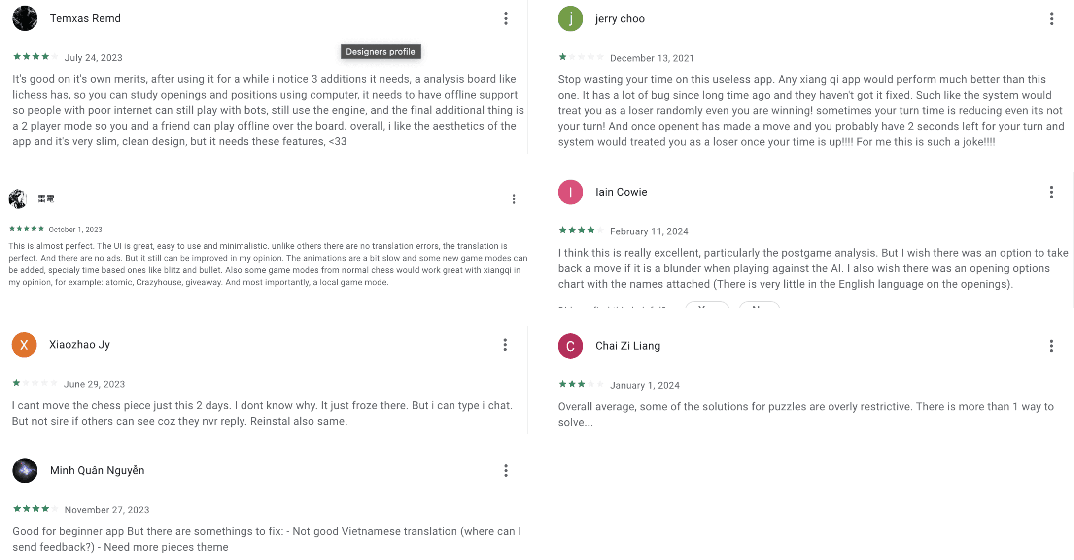
User reviews
I explored online reviews and comments from Play Store and App Store to identify user problems.

Ideation
Information Architecture
I created an information architecture by discussing related features with the Product Manager, which was based on an understanding of the existing structure and user needs.

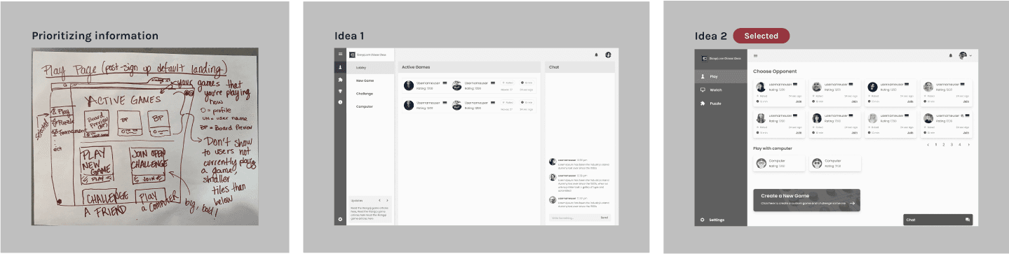
Wireframing
After prioritising the information on a paper sketch, I presented two design variations based on usability. During this process, I made sure to discuss the development cost with the Tech lead to keep it at a minimum. Idea 2 was ultimately selected, and we proceeded further.
Design
Version 2
The first iteration was quite a revamp. We received a lot of positive feedback from the users and the stakeholders. We celebrated the success with a tournament held in the company on Saturday. The design had a clear visual hierarchy, with elements prioritised according to user needs.
But, after user testing
Analyzing the heatmap.

The results weren't that great
We tested this version for 4 months but a few concerns were raised by the users:
- There were fewer users after peak hours, which made the lobby empty.
- The call-to-action button for “New game” was not prominent enough.
- The matchmaking waiting time was too long, so people preferred to play with the AI bots.
Design enhancement
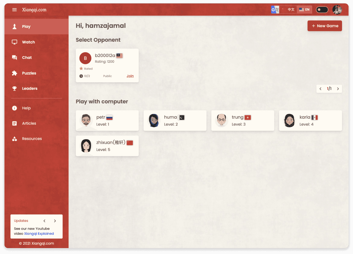
Latest Design - Version 3
After collecting 4 months of feedback, I made sure that the design should not only be flexible enough to handle empty spaces because of less users but also encourage them to play Xiangqi by giving the first impression of the game board.

Before & After
Lobby page

Signup page

Design Impact
Improvement to the user experience led to an increase in user conversion from 1.79% to 11.0%.

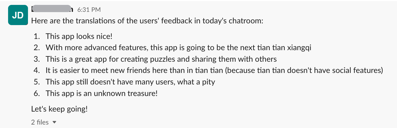
Positive user Feedback
Results
Reflection and takeaways
The design for Xiangqi was not like other platforms. It had complex challenges. I learned that the generic look and feel won't always work for a product. It has to be intuitive and simple.
- A generic look and feel won't always work for a product. It has to be intuitive and simple.
- User experience is iterative and continues to improve over time.
- The design must be flexible enough to handle any number of users and should not feel empty under any circumstances.
- It is important to focus on the features that deliver the highest value to users.
- Scope creep should be avoided. The focus should be on creating MVPs.